Lezlie is a brand & creative strategist - equal parts strategy & design, 8+ years leading strategy → execution with clients, and a 15K audience built as a solo brand.
Lezlie is a brand & creative strategist - equal parts strategy & design, 8+ years leading strategy → execution with clients, and a 15K audience built as a solo brand.
Every: Design, Graphic, Animation, Interaction, Experience, Parallax, and Page is my own creation.
Every: Design, Graphic, Animation, Interaction, Experience, Parallax, and Page is my own creation.
Hi! I’m Lezlie 👋
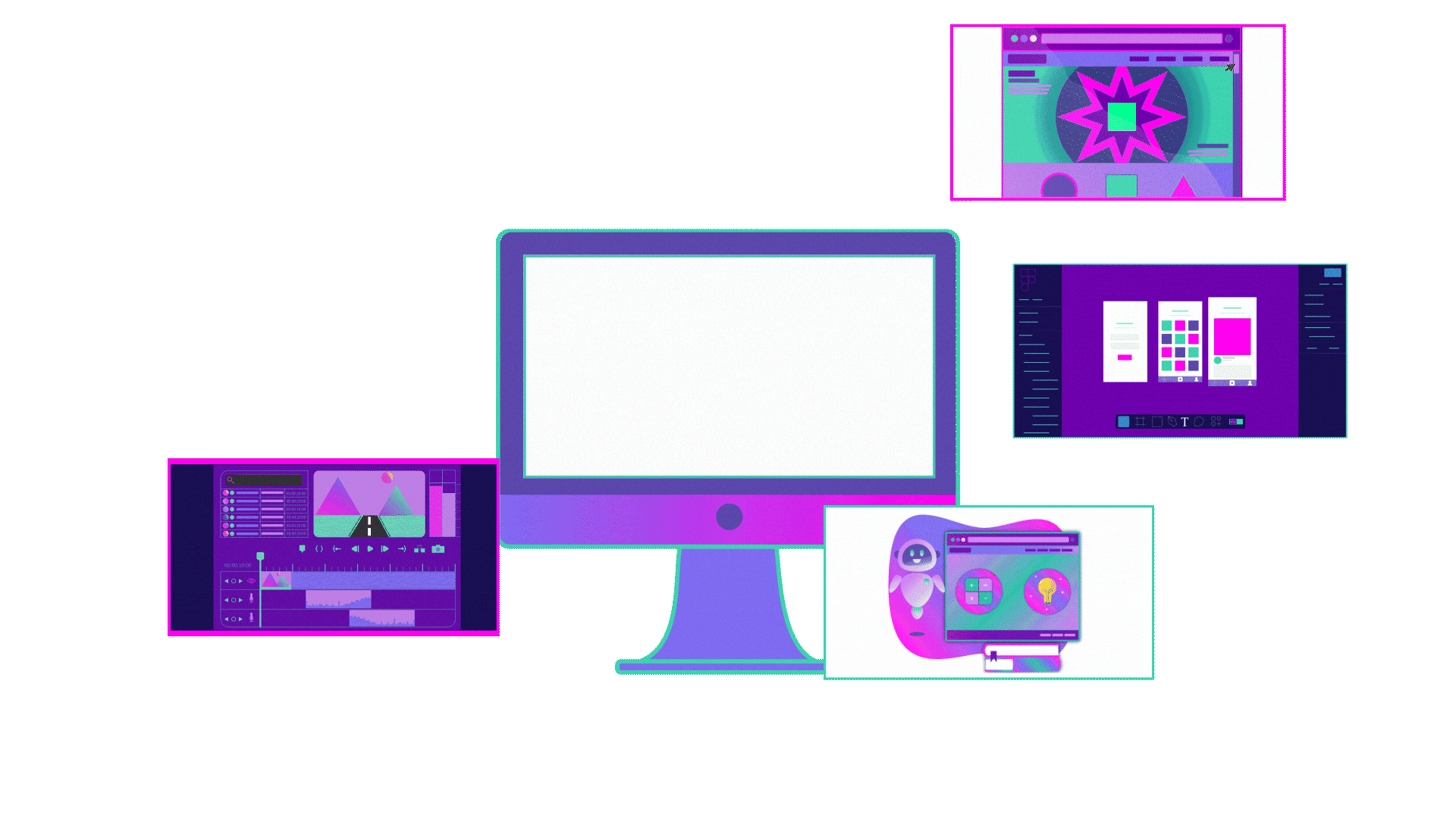
Below, my design expertise is split into 3 key focus areas. Select a category to see my work in each area.
I design user-friendly, data-driven web and digital experiences that are both functional and delightful, driving engagement and achieving meaningful results.
Through graphic & motion design, branding, marketing communications, and more, I create visually engaging designs that capture attention and leave a lasting impression.
Leveraging my teaching background, I craft impactful learning experiences that drive measurable results in corporate training and learning & development.
I use artificial intelligence as a co-creator in my design processes across brand/visual, web, and learning.
I actively integrate generative AI tools and models to develop bold, future-forward visual narratives, accelerate ideation, streamline workflows, and create dynamic, adaptive assets.