


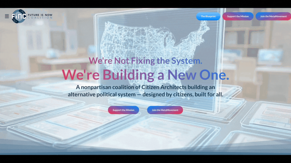
Hero Video: Created in collaboration with AI
Top Bar: Transparency increasing on scroll.
Easy Access: Join & Donate buttons in the top bar
Compelling Messaging: Based on user and SEO research.
Interactive Elements: Section is Sticky to Top, with scrollable images, text, and color-changing background.
Motion Design: Coninuous-loop Lottie animations to provide visual intrigue.
Interactive Element: Scroll-triggered text reveal in a sticky-to-top container.
Optimized & Interactive Content Delivery: Flip-cards present concepts in a user-friendly, easy-to-understand layout.

Stacking Cards: Scroll-triggered stacking cards to enable higher quantities of more complex comtent to be delivered without overwhelming the user.
Interactive Timeline: Scroll-triggered timeline in a sticky-to-top section for high user delight.

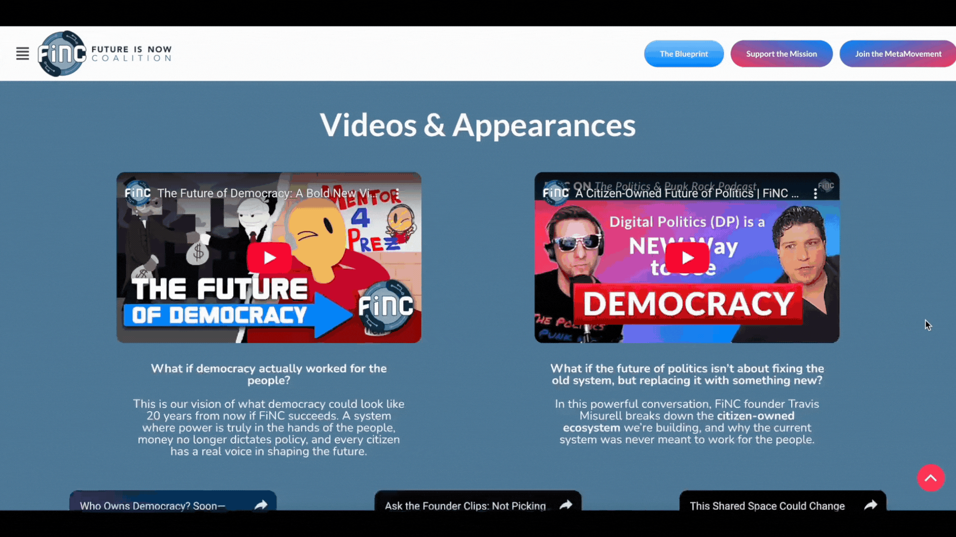
Social Proof: Videos & appearances showing more conceptual content and adding to social credibility.
Actionable Content: Providing a free actionable resource and inviting to join the movement.
Support Options: Offering opportunity to donate in addition to the above invitation to join.
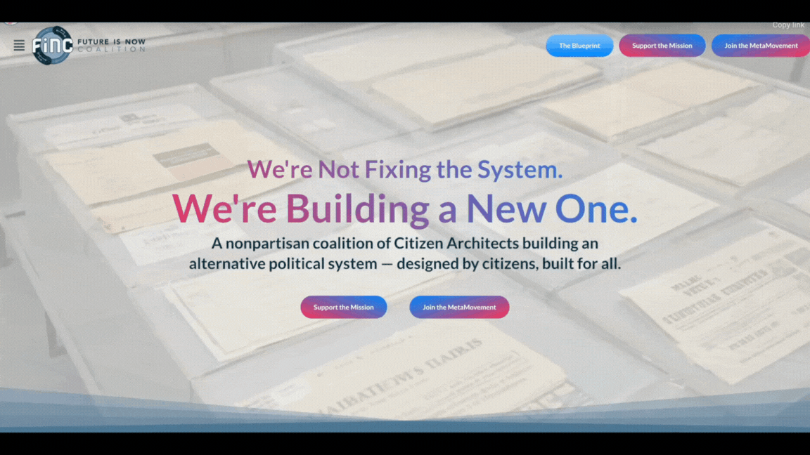
Above the Fold
Hero Video +
Gradient Text + Engagement Buttons
Intro
Scroll-triggered Text
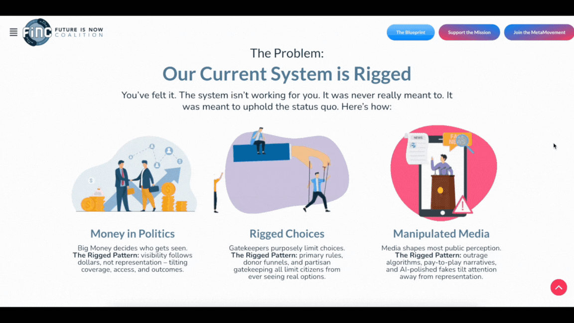
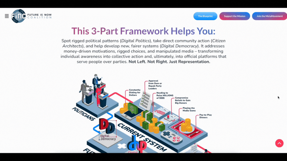
The Problem
Motion Animations +
Hover Interactions
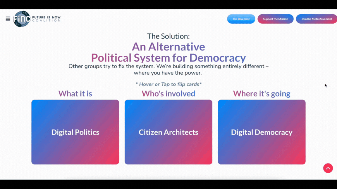
The Solution
Hover Animations & Scroll-Triggered Motion
Timeline
Interactive/Scroll-triggered
Closing
Social Proof, Actionable Content, & CTAs
